Now, it just wouldn't be right to have one type of tree all over the world right? That's what I was thinking.
Now, over time i'll be creating many new different kinds of trees based on the regions climate.
Konoha: Oaks, Pine, Cherry blossom... That spring season kind of stuff!
Suna: Hmmm haha, I think we'll go with some cactus and other desert like plants!
Mist: Geographical features have only been shown a slight bit, but no worries. I'll do as much research as possible, and if anyone has any kinds of suggestions, please post them in this topic!
Sound: Same as above. But there's plenty of trees out there in the real world which we could use reference to! If we have to use those, by all means we'll do it to ensure that Oturan is a beautiful and creative world.
Now, i'll be posting the stages of my tree sprite, just to show some people who have begun to sprite or who wish to learn a little more can learn from hopefully.
I'm not the best spriter but I can try
First up, We have our rough sketch, I didn't bother doing concept art, because I see that as a waste of time... and instead I do it with pixels!
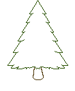
It's about 110 Pixels wide and 134 pixels in width. Nothing to perfect, just an estimate of a decent sized tree. Most tree's in Oturan will be around the 100-200 pixel size. Maybe some trees will be "Huge" as in 250+ like the Sequoia Trees found in California, U.S!
Also, since i'm not the original spriter for the tree that is currently being used, it is clear that we have a different style. I'll do my best to mimic that and make them look somewhat similar!
Alright! 30 seconds later, we have the second step. This is by far the easiest step of all, just look how much time it takes to complete
This step was the fill-in process. A step which creates a base for shading and dithering!
I've used the most common brown and green found in the other tree, and simply filled in the corresponding areas.
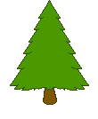
Ok, 2 minutes later, i've made a very subtle change to the sprite.
It may be a little hard to see at the moment, but if you look closely, i've darkened the right side of the trees outline. This is because our light source, being the same as the other tree, is the upper left area, as in the Sun.

Okay, 10 minutes later, and i've gone in and detailed the tree more. This will define the tree's attributes, being kinda narrow with spinney needles.
a natural part in being able to tell a tree from another
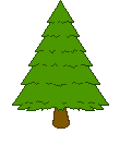
Alright. another 10 minutes have passed by, and I did the basic shadow shading.
Shadow shading is the part of shading that deals with the shadow...
Obvious huh? Since the light source is in the upper left, our shadow will start from near the right top part of the tree, and work its way down the right side, all the way to the bottom.
Now at the bottom of a tree, less light is hitting it because it's being blocked by other portions of the tree. Thus, we have more shadowing.
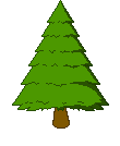
Alright! one dark color of shading is generally for a cel-shaded kind of presentation.
But since this is using a dynamically shaded base, all things must act accordingly.
I've went ahead and used another, but slightly lighter version of green, for a second layer of shading.
We don't cover the outlines of the whole tree with 2 different layers of shading. Why is this? Because that's pillow shading and it makes it seem like the middle of the tree is lighter than the outsides, and seems like a lightbulb is in the middle!
Anyways, for the next update...
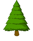
Now I have a question, to dither, or not to dither? (the tiny dots of shading)
Tell me what you think. I could also re-do the tree that we have, to match this style. Kind of like taking the dithering part away, to make the shading more direct and dynamic!
1 more step to go ;D
Lastly, I went in one more time, added a little more shadow dithering, and added the light spots to the tree with some slight shading and dithering.
And finally I went on to the tree bark and created a dark bark with few highlights, so it shows that the sunlight is mainly blocked off by the tree's leaves and such, but not too dark and showing highlights for the reflective light off of other things like grass.
This is the final product, Enjoy

Now, over time i'll be creating many new different kinds of trees based on the regions climate.
Konoha: Oaks, Pine, Cherry blossom... That spring season kind of stuff!
Suna: Hmmm haha, I think we'll go with some cactus and other desert like plants!
Mist: Geographical features have only been shown a slight bit, but no worries. I'll do as much research as possible, and if anyone has any kinds of suggestions, please post them in this topic!
Sound: Same as above. But there's plenty of trees out there in the real world which we could use reference to! If we have to use those, by all means we'll do it to ensure that Oturan is a beautiful and creative world.
Now, i'll be posting the stages of my tree sprite, just to show some people who have begun to sprite or who wish to learn a little more can learn from hopefully.
I'm not the best spriter but I can try

First up, We have our rough sketch, I didn't bother doing concept art, because I see that as a waste of time... and instead I do it with pixels!

It's about 110 Pixels wide and 134 pixels in width. Nothing to perfect, just an estimate of a decent sized tree. Most tree's in Oturan will be around the 100-200 pixel size. Maybe some trees will be "Huge" as in 250+ like the Sequoia Trees found in California, U.S!
Also, since i'm not the original spriter for the tree that is currently being used, it is clear that we have a different style. I'll do my best to mimic that and make them look somewhat similar!
Alright! 30 seconds later, we have the second step. This is by far the easiest step of all, just look how much time it takes to complete

This step was the fill-in process. A step which creates a base for shading and dithering!
I've used the most common brown and green found in the other tree, and simply filled in the corresponding areas.

Ok, 2 minutes later, i've made a very subtle change to the sprite.
It may be a little hard to see at the moment, but if you look closely, i've darkened the right side of the trees outline. This is because our light source, being the same as the other tree, is the upper left area, as in the Sun.

Okay, 10 minutes later, and i've gone in and detailed the tree more. This will define the tree's attributes, being kinda narrow with spinney needles.
a natural part in being able to tell a tree from another


Alright. another 10 minutes have passed by, and I did the basic shadow shading.
Shadow shading is the part of shading that deals with the shadow...
Obvious huh? Since the light source is in the upper left, our shadow will start from near the right top part of the tree, and work its way down the right side, all the way to the bottom.
Now at the bottom of a tree, less light is hitting it because it's being blocked by other portions of the tree. Thus, we have more shadowing.

Alright! one dark color of shading is generally for a cel-shaded kind of presentation.
But since this is using a dynamically shaded base, all things must act accordingly.
I've went ahead and used another, but slightly lighter version of green, for a second layer of shading.
We don't cover the outlines of the whole tree with 2 different layers of shading. Why is this? Because that's pillow shading and it makes it seem like the middle of the tree is lighter than the outsides, and seems like a lightbulb is in the middle!

Anyways, for the next update...

Now I have a question, to dither, or not to dither? (the tiny dots of shading)
Tell me what you think. I could also re-do the tree that we have, to match this style. Kind of like taking the dithering part away, to make the shading more direct and dynamic!
1 more step to go ;D
Lastly, I went in one more time, added a little more shadow dithering, and added the light spots to the tree with some slight shading and dithering.
And finally I went on to the tree bark and created a dark bark with few highlights, so it shows that the sunlight is mainly blocked off by the tree's leaves and such, but not too dark and showing highlights for the reflective light off of other things like grass.
This is the final product, Enjoy


Last edited by Tydon on Fri Jan 15, 2010 1:08 am; edited 4 times in total

 Home
Home


